Introducing a new look for Wigan Warriors

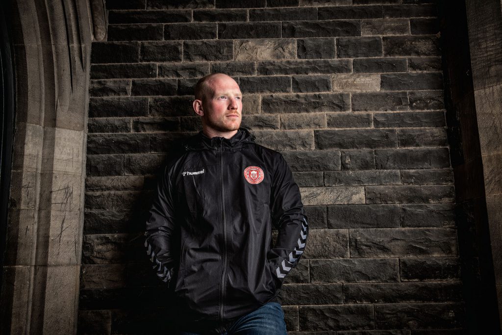
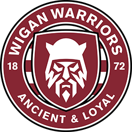
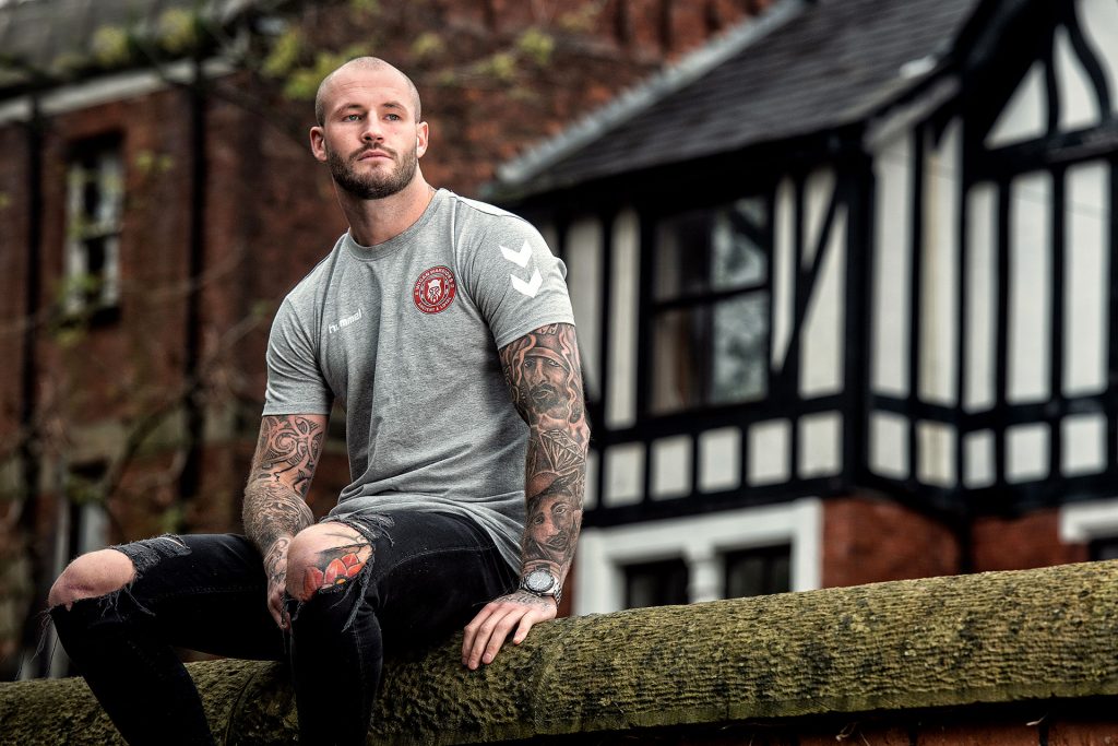
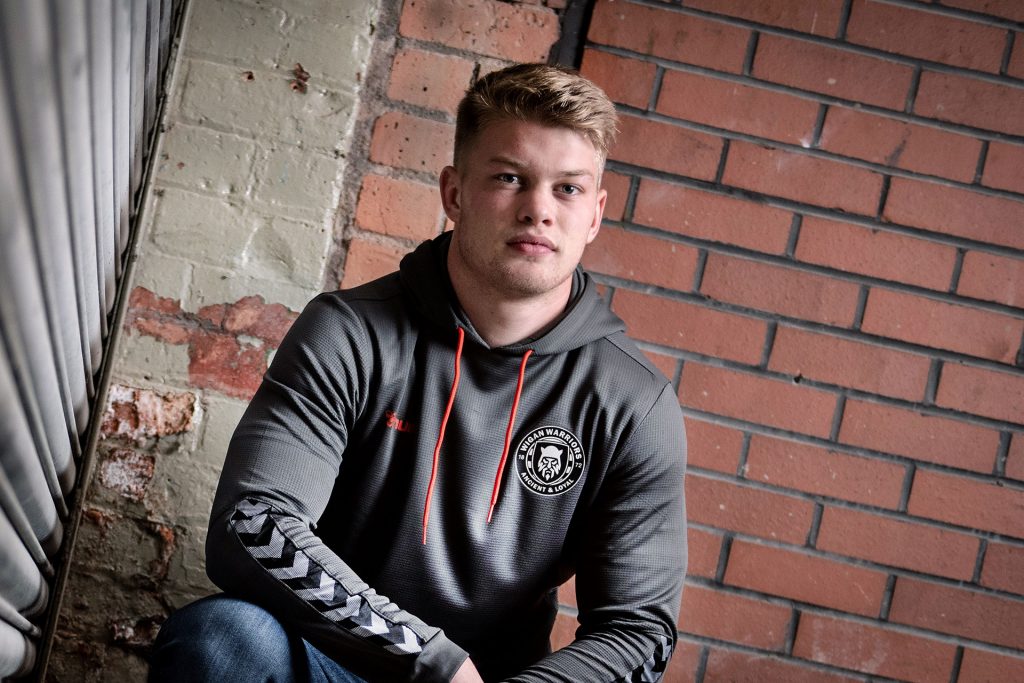
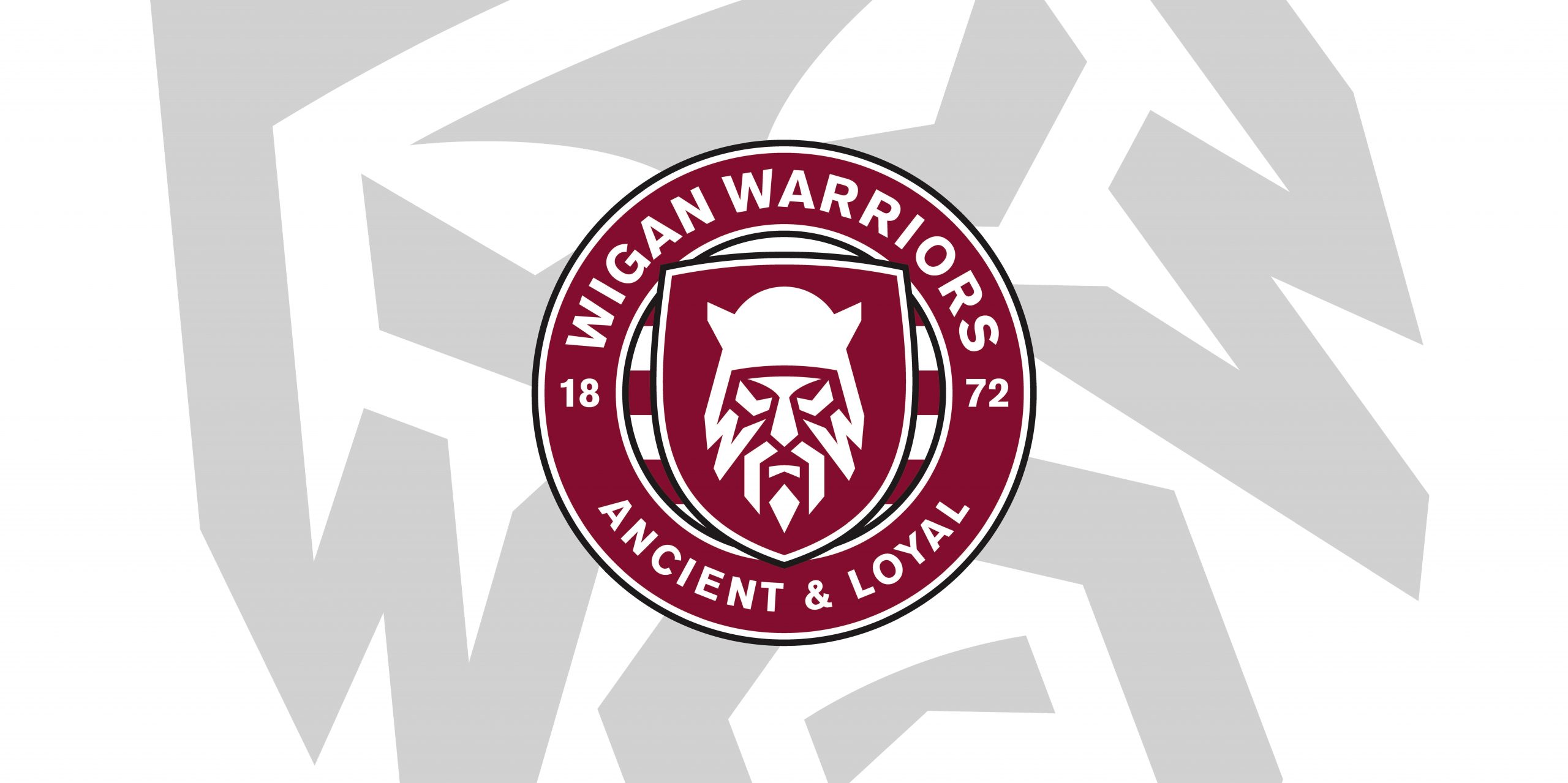
Wigan Warriors proudly unveil the striking new badge that will represent the club for the 2021 Super League season and beyond.

Dare you look straight into the eyes of the Warrior?

Our New Badge

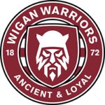
Noticeably different from anything ever sported on the famous Cherry and White jersey before, our new look introduces a fierce and determined Warrior for the first time, whilst retaining some key elements of the old crest – who we are and what we stand for – and representing club and town alike with some subtle design elements.

Wigan Warriors’ New Image: The Why and the How

Why is the most striking element of Wigan Warriors’ identity changing and how have we reached this monumental change?

This extensive process is explained forthwith…

The Why

As the sport of rugby league celebrates its 125th Anniversary, one of its most famous, recognisable and decorated clubs is looking to evolve as the sport faces up to another set of challenges in the 21st century.

In the digital age, with competition for fans’ attention and interest – both future and current – all Super League clubs are facing a challenge to remain at the forefront of sports’ fans thoughts, as the way supporters consume the wonderful product of rugby league continues to change. The challenge? To create a Wigan Warrior that’s prepared to face it in a way that Wigan Rugby League Club has always faced challenges in this sport: leading from the front, prepared to be bold, to show steeliness and resolve. It needs a Warrior that can tap into the rich lineage and strong foundations that give this sporting institution the virtues and DNA that have made it the sport’s most successful Club.

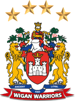
The current Wigan Warriors crest is the most traditional in the sport. The crest will always remain part of the Club’s identity and will still have a key role to play for the Club moving forward. This rebrand is not a binary proposition. Not out with the old and in with the new. Yet, when faced with the reality of inspiring a new generation of supporters to carry our rich tradition forward, to find new fans away from the sport and to maximise our exposure on digital platforms and broadcast media, providing commercial opportunities to secure this sport’s future. In the uncertain climate we are experiencing, change is needed. Moving forward to a world class identity is the reason underpinning this period of transformation.

The How

“Those who drink from the well should always remember who dug it.” – Chinese proverb

Any change to such a distinctive and recognisable crest – a crest that invokes memories and tradition that have been passed down from generation to generation – is one that needs to be with that weight of history as part of the process. During the research, it was identified that the town of Wigan, the original town coat of arms and key language, iconography and colourings would guide this process.

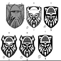
It was decided that the ‘Brigante Warrior’ – who in pre-Roman times controlled the largest section of what would become Northern England and had roots and lineage in the town of Wigan – would be referenced in this design. Elements of the Warrior’s facial expression, distinctive hair, face markings, helmet and shield would form part of the process that brings to life the Warrior moniker that has been part of the Wigan Rugby League’s Super League story.

Two non-negotiables that the Club couldn’t lose in any rebrand would be the Cherry and White colour scheme and Club motto: Ancient & Loyal. The Wigan Warriors fanbase is the 18th man. No more so has the Club seen this than in the incredible reaction to the Covid-19 crisis and the resulting uncertainty all sport, indeed, society is facing. These two elements are proudly represented and referenced in the new crest, adding to the commitment that we must harbour and hone that tradition in any rebrand exercise.

The Warrior itself needed to represent that steeliness that Wigan rugby league is famous for. How many times has a Wigan rugby league side, a Wigan player, sportsman or sportswoman shown that glare, that pierced gaze – imperturbable, implacable, immensely focused – when achieving greatness? This is what sets this wonderful institution apart from others. A relentless focus on success, a resilience and confidence that one can only have through experience. Others look to attain this greatness; Wigan Rugby League Club possess this in its very being.

The Designer

The new Wigan Warriors badge has been created by renowned design studio Nomad, whose work with the likes of the Premier League and Sky Sports has been catching the eye of sports fans for many years, with both of the aforementioned institutions current looks having been designed by the London-based studio.

The man behind this crucial project is Stuart Watson, a partner at Nomad and locally raised in our area, so the full weight of expectations weighing upon his shoulders was fully apparent as he began to craft our new image. Hear his thoughts on the project here…

The Journey

What It Means

The Process

Nearly a year of development and the support of countless partners has gone into creating the new badge that we will proudly sport in 2021 and beyond.

Here’s the timeline of how we have turned a vision into a reality…

December 2019

  • Super League propose their desire for a competition-wide club re-brand to attract new/younger audiences, signal new ambition/confidence and increase ‘visibility and desirability’ across all channels

January 2020

  • Nick Payne from Robin Consultancy, tasked by Super League to begin this process, launches consultations with various stakeholders within the Club
  • Those consulted include chairman Ian Lenagan and family, senior Club officials, marketing and commercial department, fan panel featuring cross section of all ages and media partners

February 2020

  • Feedback from consultancy meetings shared with the Club
  • Existing crest thought to be ‘outdated’ and ‘not aligned with digital communications’

March 2020

  • Design brief created by Nick Payne at Robin Consultancy

April 2020

  • Stuart Watson at Nomad shares his initial concept ideas with the Club
  • A number of alterations are made to the initial badge proposals

May 2020

  • Further alterations to the badge take place

June 2020

  • Final sign off on the new badge
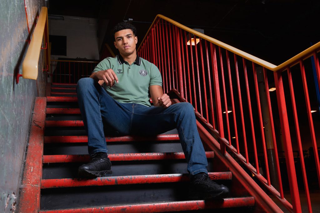
  • Final sign off on 2021 match kits and training range, featuring the new badge

July 2020

  • Bulk of the new retail range ordered to showcase our new look

August 2020

  • Internal working group meetings commence for brainstorming of wider launch ideas
  • The Club’s creative agency, Fishtank, are briefed on how we aim to implement the new badge across every aspect of the organisation, including areas such as the Community Foundation, Education Academy and Lotto

September 2020

  • Working group meetings look into the crucial retail, marketing and commercial aspects of launching the new badge
  • Legal trademarking of new badge undertaken
  • Extensive audit on all Club property takes place to discover where the old crest will need replacing with the new badge

October 2020

  • Secret photoshoot for 2021 kit featuring the all-new badge
  • Final sign off on brand guidelines, sub brands, microsite and FAQs
  • Shooting of badge launch video and extensive creation of awareness-generating content
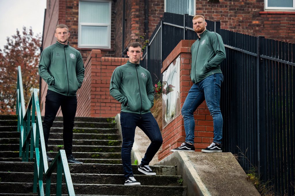
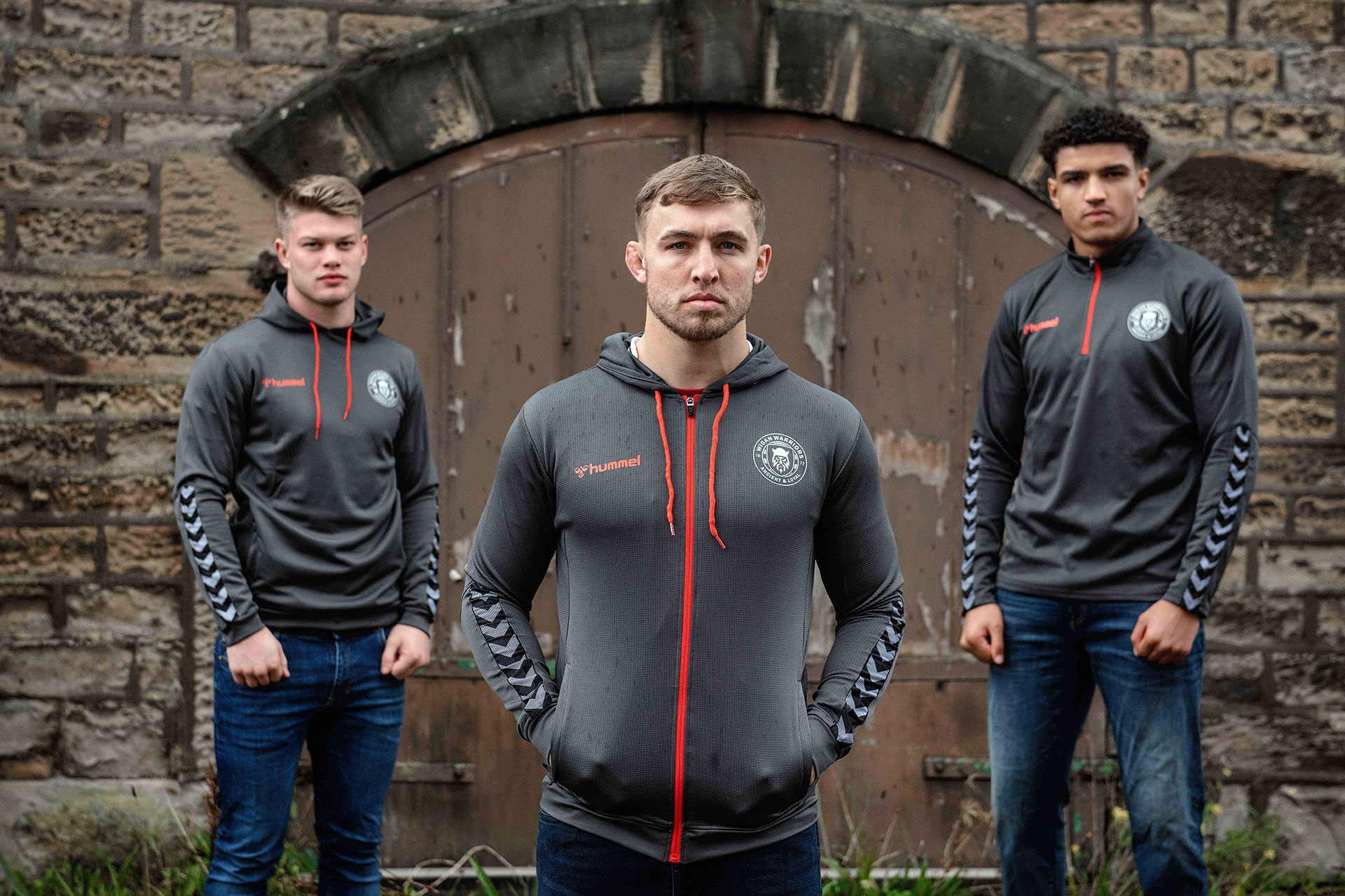
  • New 2021 kit and teamwear on sale

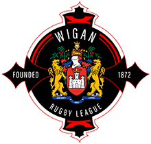
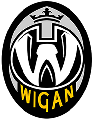
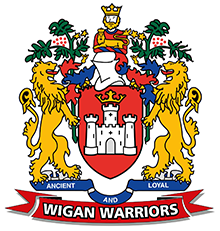
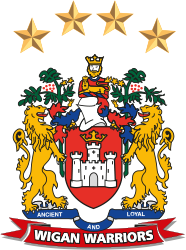
Our Crest History

1960-1991

1992-1996

1997-1998

1998-1999

2000-2017

2018-2020

FAQs

The Key Questions

Why do we now have a new badge?

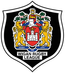
There are many reasons why we have made this bold change; some more important than others. Our existing crest is associated with cherished memories, but unfortunately doesn’t appeal to new generations in the way that it has done previously and is a difficult crest to recreate in many formats, not least in many areas of merchandising where clubs with a fresher identity hold an advantage over us in terms of the garments suited to their club logo. A competition-wide audit of Super League club logos fed back a response that our crest felt dated compared to the rest of the division. Therefore, armed with the offer of one of the most renowned design agencies in the country, Nomad, to guide us through the process, we felt that it was an opportune time to give us an exciting new look to give us a fresh and easily identifiable new badge to use for many years to come. We needed something fit for the digital and broadcast age which would appeal to the many new audiences that we’re keen to attract, ensuring that we always have a ‘next generation’ of fans ready to back the Club and continue its proud heritage… hitting 2021 and beyond with an energy and optimism that isn’t as prevalent elsewhere in professional sport right now due to obvious global challenges. Nomad – who were behind the positive re-designs of the Premier League brand and Sky Sports’ identity in recent years – have carefully taken on board our key requests on what needs to be part of the new badge and created something that we’re truly proud of, and hope all of our fans will be too.

Where will this badge be used and are we retaining the existing crest anywhere?

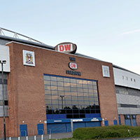
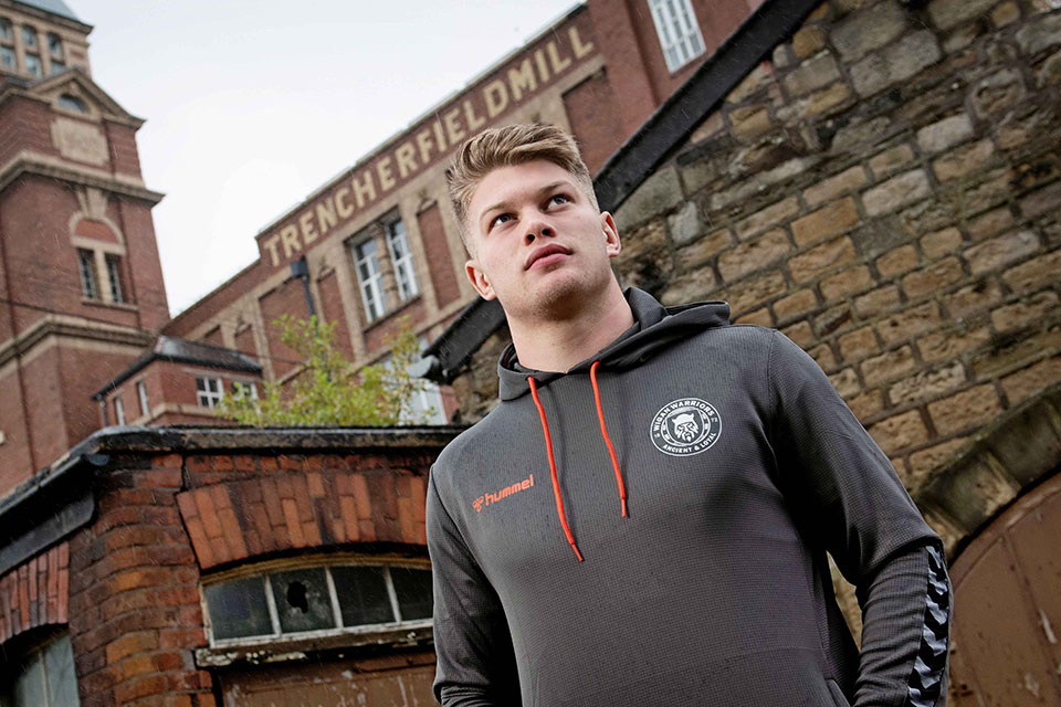
This will become the club’s primary badge for all the places you’d normally expect to see it – on our kit, merchandise, stadium signage, across our media channels, on live TV coverage and so on. It will be a big process to roll it out in place of the existing crest, but you can expect to see it much more prevalently in the coming months as we add it to the DW Stadium, Robin Park Arena and all of our external advertising, complimenting the immediate switch we have already made across our website and social media platforms. We will continue to use the existing crest on our kit and training wear until the end of the 2020 season before adopting it on the new Hummel range for 2021 and beyond. You will continue to see the existing crest tastefully used where it’s appropriate, e.g. on merchandise heritage ranges, on historical/flashback content or – we hope – on items such as players’ suit jackets if we make future Wembley finals, where something like the iconic town crest feels like a more fitting addition to the garment and the occasion.

Who has been consulted over this change?

This has been a huge exercise for the whole club, featuring every department of the club and every tier of staff, working alongside some hugely important people to make sure that we’ve got it right before launching. A number of senior figures within the club – including our ownership group – began the consultation process with Nomad to create the outline design, which has then been refined through feedback from a sub-committee of several members of staff and a selection of supporters from a wide-cross section of our fanbase; young and old, local and exiled (who have been hugely supportive and tremendously trustworthy in keeping this information away from the public domain). The same groups have then been responsible for creating the wide array of videos, microsites, social media teasers and countless other content pieces that have helped to bring the new design to life, with support from our long-standing design partners Fishtank, external media organisations, researchers from local universities and key figures within the game, who have given us some valuable time and feedback to ensure that the process has been as thoroughly researched and prepared as possible.

Why are we changing our look in the middle of the Covid-19 pandemic?

In many ways, there has never been a better time to make this change. Though it was planned long before we knew how this remarkable year was going to unfold, we have carried through with our plans to unveil it in 2020 as we feel that it shows great belief that we’re going to come out of this challenge stronger and more ambitious than ever before. The world has changed so much in recent months so it’s a natural fit to make these changes while we’re adapting to new ways of thinking, working and living. We trust that it will become synonymous with a new era of success for the club following the remarkable and unusual challenges that the current year has presented us with.

Are we alone in making this change?

No. A number of Super League clubs are also in consultation with Nomad as to how they can modify their appearance to create a more modern and easily identifiable appearance, but – as is customary for Wigan – we have taken the bold step of being the first club to confirm our new look and lead where others follow.

Badge Design

There aren’t many other round badges in Rugby League. Why have we gone for that shape?

Being distinctive within our sport is something that we look upon as an advantage; we have always stood out for our on-field achievements and we intend to stand out for all the right reasons with this new look for our club. There are undoubted crossovers with other professional sports clubs’ badges, but this is reflective of the modern feel of how clubs are presenting themselves, much in the same way that half a century ago – or more – the use of detailed town crests as part of a club’s identity was the prevalent way to go.

Why have we not kept any of the traditional elements of the existing crest?

Unlike some clubs who had one distinctly traditional design element of a previous crest that you couldn’t imagine them ever being without, there is so much detail to our existing crest, that you could ask 100 fans their views on which elements to retain and get 100 different answers. Ultimately, with no one part of the existing design being uniquely Wigan Warriors, and instead being part of the town’s wider identity, this has provided us with a chance to look at what makes up Wigan Warriors. As a result, for the first time we incorporate our traditional cherry and white hoops into our badge, along with the iconic year of 1872 when the first Wigan club started playing rugby and incorporated a more recent element of our identity with the Warrior getting a distinct look for the first time. Our circular design also pays homage to an entirely different chapter in our town’s proud history by evoking memories of the iconic Northern Soul logo that become synonymous with Wigan. Of course, the one key element that has stood the test of time is our proud ‘Ancient and Loyal’ motto, which is retained on the new badge and is arguably now more intrinsically linked with our club than it is with our town.

We’ve never had a warrior on our badge before, why are we starting now?

We have now been Wigan Warriors across four different decades, but this significant addition to our club’s identity has never matched up with the badge on our shirts. The distinct look of our Warrior allows us to now have a characteristic akin to the cannon at Arsenal, the Brisbane Bronco or the Raiders badge in NFL that has moved cities more than once, yet still represented the same institution… something that sports fans can see in isolation and immediately associate with our club, heightening the wider awareness of our club and our sport. It’s an element of the badge that can be seen in isolation and yet still be identifiable as Wigan Warriors, without any of the accompanying detail such as our name, year of foundation or motto that appears on the full version of the badge.

Why have we gone for something much simpler and less detailed than our existing crest?

There are many benefits to this new design; not least the fact that it’s entirely ours and not shared with other institutions within our town. This has given us a chance to incorporate cleaner lines, bolder elements and a colour scheme that is the perfect fit with our club colours for the first time. Now that we’re into the digital age, this design – placed side by side against our existing crest – stands out and our name is given much greater visibility in the increasingly important area of digital media, helping us to gain recognition among new fans, far and wide. Whilst it wasn’t at the top of our list of considerations, the circle is also the perfect shape for social media platforms, so we’re maximising the chance to make our identity stand out in that critical area of communications where thousands of elite professional sports clubs are competing for attention.

Why is it round? Couldn’t we have put a shield around our existing crest?

The decision to go for a circle provided many strategic advantages, such as those we’ve already mentioned like the subtle connection to Northern Soul and the perfect (and increasingly important) fit for social media, but it also proved to be one of the tidiest and most flexible options when thinking about the kind of places it’s likely to be seen. It’s no coincidence that some of the world’s leading sports clubs like Manchester City, Paris St Germain, Inter Milan and David Beckham’s Inter Miami have opted for a circular badge; they’re some of the leading lights in maximising awareness of their identity and have gone for this shape because it seems to work better than other ways of providing a defined border to the badge. If we’d simply added a border to our current crest, we’d run the risk of further squashing an already detailed logo into an even smaller space on a number of different platforms where it already starts to look a bit squashed (e.g. social media profile images, small icons on fixture lists, etc).

Where’s the emotional link to the town gone? The coat of arms was Wigan, this doesn’t represent our home town in the same way.

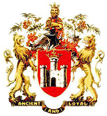
We’ve always represented our town with pride and will never lose that contact, hence why the existing crest will continue to be used as a heritage design; e.g. on reproductions of classic shirts, historical content or for possible incorporation as a cup final blazer embroidery; much like the way Manchester United players sport their city’s coat of arms on their official suit when traveling to games. The new badge that will appear on our playing shirt, stationary, merchandise and any representations of the club in the media is able to pay greater homage to our identity as a club through all of the more personalised elements that we’ve now introduced. We trust that keeping both designs for different uses ensures that we can be proud of both our club and town identity.

Badge Elements

What is the purpose of the Warrior?

We’ve long held the Wigan Warriors name, but never been able to provide the warrior element with a clear visual identity. Now we have a figurehead as part of our crest that can help everyone to visualise what Wigan’s warrior looks like. The striking design includes some key features that make him unique to our club and town, including – for starters – him being a Brigante warrior, and the connection to our town’s roots that entails. His piercing eyes are a deeper look into the steely determination and relentless nature of Wigan people – something in our eyes that you just have to know to understand (or fear if you hail from elsewhere)! A subtle reference to our name is incorporated into his beard, shaped to form a visual WW across both sides of the face.

Why is the new badge predominantly cherry and white?

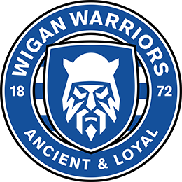
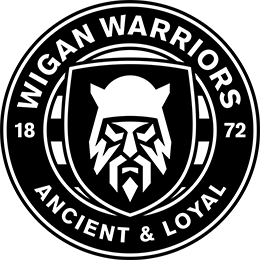
We’re proud of our historic colours, so it made perfect sense for these to be the lead colours on our new design, with subtle use of black outlines where needed. The beauty of this predominantly single colour design is that we can be more versatile in how the badge can be used on replica kits to fit in with the overall design. Cherry and white remains the primary colour scheme and will always feature on our home strip, but should we decide to go with a predominant colour on an away strip that wouldn’t necessarily look quite right with a mainly cherry badge (e.g. colours like black or purple that we’ve used in recent seasons), we can change the badge colour to match the strip (or provide a more aesthetically pleasing colour contrast) in those situations, as teams as diverse as Celtic, LA Lakers and South Sydney Rabbitohs have done with recent strips.

Why does it say 1872 on the badge?

The date pays homage to the first Wigan rugby team, who played their first game in that year and were the forerunners to the club we now know and love. In changing the look and feel of the badge from something historic, we felt that it was important to pay tribute to a different part of our back story by including this significant date – especially given that we’re very close to the 150th anniversary of rugby being played in Wigan.

Why is there no reference to ‘rugby league’ in the badge?

It’s a fair question, but nor does our existing crest either, which has simply read ‘Wigan Warriors’ since the mid-00s, having previously been adorned with ‘Wigan R.L.’ for a few years either side of the turn of the Millennium. Our long-standing belief is that the Wigan name – especially when quantified with our full Wigan Warriors title – is unmistakably intertwined with the concept of rugby league itself and that to many people, we ARE rugby league, so we’re confident enough to leave this off our badge to keep it clean and un-cluttered and help to reinforce the Wigan Warriors name as boldly and widely as possible. When you look at almost every instantly recognisable team logo from the world of professional sport – think Chicago Bulls, New York Yankees, Manchester United – none of them reference the sport they play by name, and many don’t give any clues visually either, because their reputation and achievements transcend the sport they play. We’re confident that we belong in that company.

What do other Super League clubs have on their badges to help people recognise that they’re rugby league clubs?

Looking around the current badges of our fellow Super League clubs, you’ll see a neat split between those who just utilise the club name (e.g. Warrington Wolves, Leeds Rhinos) and those who use a number of different styles to reference the sport (e.g. Wakefield Trinity RLFC, Hull Kingston Rovers RFC and St Helens R.F.C.). In terms of design elements, none of the current badges feature a rugby ball; the nearest match is the shape of the Catalans Dragons and St Helens badges.

Wider usage

I’ve seen variants of the badge already to feature Lotto, Community Foundation, Education Academy and the like. Has the whole club got a new look?

Yes, every department and offshoot of the club is now utilising the new badge and the accompanying stationery that we have designed to provide consistency across every part of the Wigan Warriors family. Where it is used for activities not directly delivered in relation to the club’s primary rugby league activities – e.g. community work, our sport and leisure facilities at Robin Park Arena, etc – they use a variant of the new badge with accompanying text to denote their identity. Any old logos that were previously used by the Warriors Lotto, Community Foundation, etc, have now been discontinued and will be removed from circulation as soon as possible. It will give our whole club a fresh and exciting look in every area, catching new eyes that can hopefully support the many great components of our forward-thinking institution.

I have the old crest somewhere deeply personal to me. Where do I stand now that there’s a new badge?

We’re aware that supporters have incorporated our existing crest into a wonderfully diverse range of locations with great personal significance. We have seen tattoos, murals and even engraved headstones within cemeteries featuring the current crest. Our advice is that you don’t erase history, but embrace it by keeping it as a lasting reminder of you or your loved ones’ passion for the club. If you want to contact us to discuss ways we can adapt existing designs to add the new badge too, please contact info@wiganwarriors.com and we may be able to help in certain situations.

Testimonials

“The badge and eyes of this particular Warrior are the eyes of every single Wiganer. It’s defiance, it’s that determination to succeed, to prove people wrong. I love the way the ‘WW’s are created in the beard; I love the eyes – I really think it reflects Wiganers well.”

“We hope people understand it is more than a badge – it’s about being part of this town. It’s about being that rebellious soul, this defiant character who’s going to succeed. Because that’s what Wiganers do, we succeed.”

Kris Radlinski, Wigan Warriors executive director and club legend

“My initial thought – I quite like it. We’ve still got the ‘Ancient and Loyal’ in there; we’ve still got the 1872 when we were formed; we’ve got the cherry and white; we’ve got the Warrior…”

“Then you’ve got the piercing eyes that will reflect to a lot of Wiganers. When you look into a Wiganer’s eyes, they want to win. The way that the badge looks, it starts to grow on you when you start to look at what’s actually in there.”

Keith Sutch, Club historian

“You can really see how the new badge offers flexibility to help create a new identity for the Club, with the Warrior being something that you can imagine being used in isolation on things like TV coverage, social media icons, clothing and so on.”

“It really helps the Club to be like the way they do things in the NRL… there’s always that one element of every club’s badge that you can see in isolation and still instantly connect it to that club, so I think that the Warrior is going to be perfect to help people make that instant connection to Wigan.”

Sean Lawless, Wigan Fan TV

“The club’s fans are the ones that walk around the streets wearing this badge, promoting it on a regular basis. Having something that they’re proud of and want to wear all round the world, as is the case with a club like Wigan, means that you’ve got something where other people are going to say ‘that’s nice – where did you get it from?’.”

“When we did our benchmarking for a partner to undertake this process, Nomad were the perfect choice based on the work that they’ve done with Sky Sports and the Premier League and their pride and passion shines through with what they’ve done.”

Rob Porteous, head of marketing, Super League Europe

The Next Steps

The launch of our new badge will lead to some exciting launches in the weeks and months ahead. Here are the key dates for you to remember:

1st November: Training kit and travel wear range launched via our online store

4th November: New 2021 home kit to be unveiled

18th November: New 2021 away kit to be launched

Mid November onwards: Fantastic Christmas range goes live, including our stylish 2021 calendar

December: Exciting new retail development planned – watch this space!